views
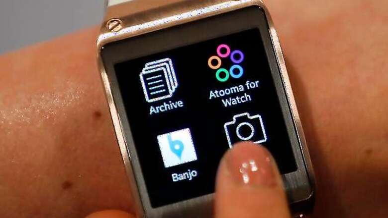
New York: It didn't take long to see how a computerised wristwatch might help manage my digital life - or to see how Samsung's new Galaxy Gear smartwatch falls short.
First, the potential: Smartwatches are supposed to offer quick access to many of the things you normally do on your phone, such as checking messages, taking photos, checking the weather and answering calls. You can install apps for additional functionality that lets you track fitness activities and play games. It's like having the power of your smartphone on your wrist.
That sounds great in principle. These gadgets aren't meant to replace phones; they're supposed to work with phones to display the information you need most. While I'm wearing the Galaxy Gear, I can glance at my wrist for messages during dinner or at a movie, as if I'm checking the time. It's not so obvious that I'm being rude, the way pulling out a phone would be.
Samsung's Gear is stylish. Its 1.6-inch screen, measured diagonally, keeps the watch small enough - at least for men - to work as a fashion accessory. Straps come in six colours. For now, the Gear works only with the new 5.7-inch Galaxy Note 3 phone.
The Gear costs about $300 (Rs 22,990 in India) and the Note 3 another $300 (Rs 49,990 in India), with a two-year service agreement. So until Samsung updates the software on its older phones, you need to buy both the Gear and the Note 3. For $600, this better do a lot to manage my digital life.
I took the Gear to a street fair in Brooklyn and tried to use it to meet up with my brother and two groups of friends. I was able to read text messages and reply to a few using voice dictation. But the voice-command service is slow and makes many transcription errors. It also doesn't give me enough time to read and confirm what I'm about to send, forcing me to start over. After a few attempts, I took out the phone and started replying the normal way.
The Gear also lets you make and take phone calls right from the wrist, Dick Tracy-style, using a built-in speaker and microphone. But it was useless in a noisy environment like a street fair. Out came the phone. Even in quieter environments, there's a noticeable lag using the speakerphone, making conversations tense as we start talking over each other.
As I pushed my way through the crowds, the watch constantly alerted me to new Gmail messages and Facebook updates. But I had to go to the phone to read them. I'm not expecting lengthy email messages on the watch, but I could have at least used the sender's name and the first line or two to gauge a message's importance. The Gear tries to speed things along by opening the relevant app on the phone automatically with a few taps of the watch, but I could have easily opened that app with a few taps on the phone.
A day earlier, the camera on the watch's wristband captured my cousin's 1-year-old daughter trying to balance herself. I would have lost that moment had I waited to pull out the phone. But the share button on the watch was disabled, as apps to send them by email, text or Facebook have yet to be written. Instead, I had to transfer the photo to the phone first. Image quality also was poor, with the camera at less than 2 megapixels.
The baby's cousins had a lot of fun with a voice memo feature. Using the watch, they left me memos calling me "cookoo" and ordering me to change diapers. The messages are automatically transferred to the phone and transcribed. I was ready to like the Gear for this feature, until I saw how poor the transcriptions were. "You forgot to pack my lunch. I'm really hungry at school" became "A Dr. Pepper my hands are you hungry school."
Of the more than a dozen apps I tried, the only one that worked reliably was one that keeps track of wine bottles. Simply snap the label using the watch's camera, and the Vivino app gives you information on food pairings, average prices and user ratings. I can see it being useful in a wine store, where snapping a wine label with a phone might draw attention.
I also liked the feature for finding my phone. I used it to find the missing phone - in my backpack.
The Gear needs more of these useful apps and features - ones that actually work and give you what you need.
For now, it feels like a $300 prototype (or $600 with the companion phone). It seems as if Samsung rushed out the product to hit the holiday shopping season. It could have used a few more months to fine-tune the product and work with outside developers to make compelling apps that work.
I have no doubt Samsung will get there one day.
The Note 3, for instance, addresses many gripes I have when features are hard to discover and use. An "Air Command" tool pops up when you take out the stylus that comes with the phone. That gives you quick access to such tasks as clipping information from a Web page and storing it with a link.
The Note 3 also gives you more ways to run multiple apps at once. Like previous Samsung phones, a Multi-Window feature lets you run two apps side by side. Now, you can run up to eight other apps - such as the calculator or the clock - as small windows on top of your regular app. When you're done, just minimize the app into a small circle and move it to the side until you need it again.
This feature is even more useful on the larger, 10-inch screen found in the Galaxy Note 10.1 - 2014 Edition. That's the second edition of that size. I'll tackle Samsung's need for better nomenclature some other day.
Hopefully, Samsung will get the Gear right in its second or third try, just as it has with the new tablet and phone. Until then, I'll continue to be rude and pull out my phone at dinner.
####


Comments
0 comment