
Using Mac

Open the Excel spreadsheet you want to edit. Double-click the file's icon to open it in Microsoft Excel.
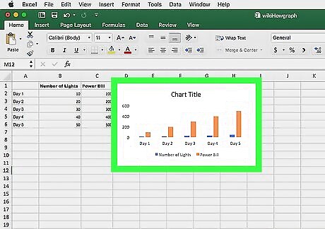
Click the chart you want to edit. Chart Design and Format tabs will appear above the toolbar ribbon at the top.
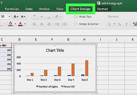
Click the Chart Design tab at the top. This will open the design tools you can use to stylize your chart.
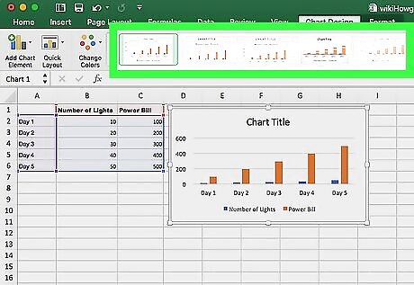
Select a chart style on the Chart Design ribbon. You'll see a list of available designs you can use in your selected chart type. Click any style here to apply it to your chart.
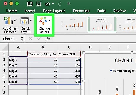
Click the Change Colors button. It's to the left of the styles list on the toolbar ribbon near the upper-left corner.
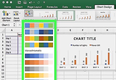
Select a color palette for your chart. You can select colorful or monochromatic color palettes for your chart here.
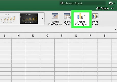
Click the Change Chart Type button. You can find it near the upper-right corner of the Chart Design toolbar. It will open a drop-down list of chart type categories. This will allow you to change your chart into a different format. For example, if you're editing a stacked bar chart, you can change it into a 3D stacked bar chart, a clustered bar chart, or a pie chart.
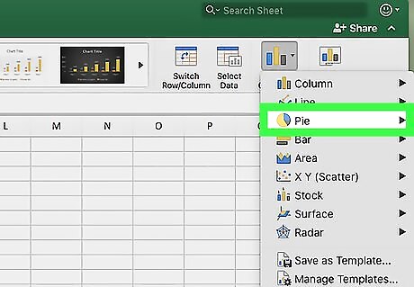
Hover over one of the chart type categories. This will show the chart types you can use in this category.
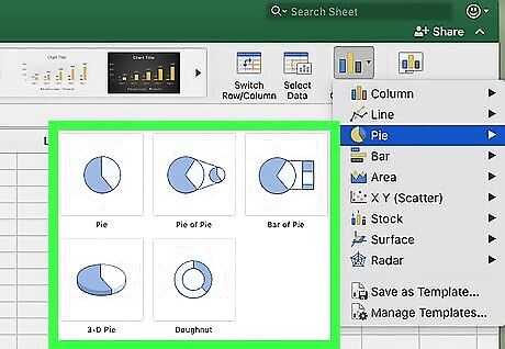
Select the chart type you want to use. This will change your chart into the selected chart type. You can still edit your chart's style and color on the toolbar ribbon.
Using Windows

Open the Excel spreadsheet you want to edit. Double-click the file's icon to open it in Microsoft Excel.
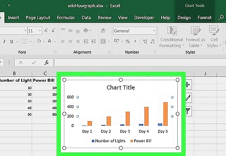
Click the chart you want to edit. Design and Format tabs will appear above the toolbar ribbon at the top.
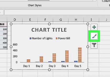
Click the paintbrush icon next to the selected chart. It's near the upper-right corner of the chart. This will open your style options in a pop-up window.
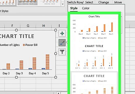
Select a chart style in the Style pop-up. Click any of the styles here to apply it to your chart.
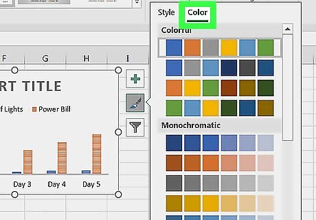
Click the Color tab. You can find it next to Style at the top of the paintbrush window. It will open a list of color palettes you can use.
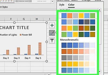
Select a color palette to use in your chart. You can use a colorful or monochromatic color palette.
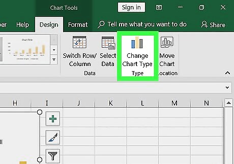
Click Change Chart Type on the toolbar ribbon. You can find it near the upper-right corner of your screen. It will open a new pop-up window. This will allow you to change your chart into a different format. For example, if you're editing a 3D pie chart, you can change it into a doughnut, scatter plot, or bar chart.
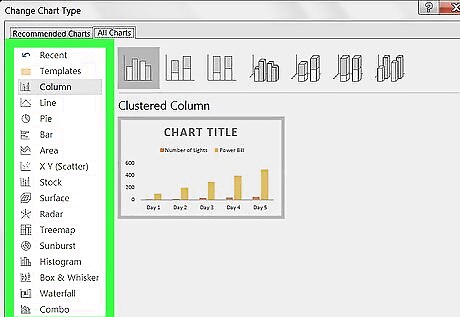
Select a chart type category on the left. This will show the chart types you can use in this category.
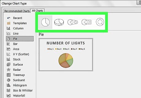
Select the chart type you want to use. This will change your original chart into the selected chart type. Click OK to apply the selected type to your chart.


Comments
0 comment