views
OnePlus will be rolling out its new OxygenOS 11 update to all eligible devices soon and it recently gave us an early look at the revamped user interface through a beta update. While the new changes do look appealing and add a modern touch to the OS, a lot of users pointed out resemblances with Samsung’s One UI.
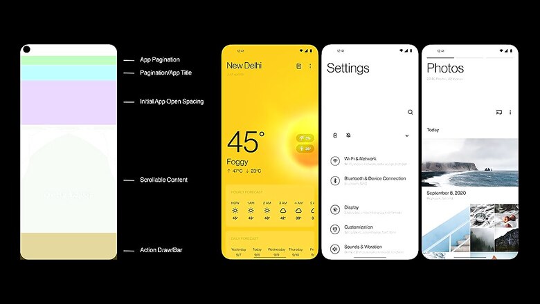
The smartphone maker has now come up with an explanation giving relevant details and the thought process behind the implementation of the new UI design. According to OnePlus, stock Android is a good starting point but adding more features on top makes the experience far better. One of the most important factors that OnePlus considered while working on the new OxygenOS update is how the increasing real-estate of displays is changing the way we use our phones. “As screens increase in size, so does the unused white space. We wanted to make the most of that space while keeping the interface easy to use,” said OnePlus in a forum post.
With the new OxygenOS 11 update, OnePlus is trying to bring improved user experience and is focusing on one-handed usage on large displays. The company has analyzed how people use phones and looked at anthropometric data to design a UI that should be more comfortable for one-handed use. It doesn’t take a scientist to determine that smartphone users tend to hold their phones from the bottom, which means that reaching the lower half of the display is easier compared to the top. “The updated layout of OxygenOS 11 now moves the touch controls closer to your thumbs for easier access as soon as you open a menu.”
Now you may or may not like the way it looks, but it makes a lot of sense and convenient for users. This is also the reason why the new OxygenOS 11 is being compared to Samsung’s One UI which includes a bunch of elements that focus on one-hand usage.













Comments
0 comment