views
Choosing Your Tools
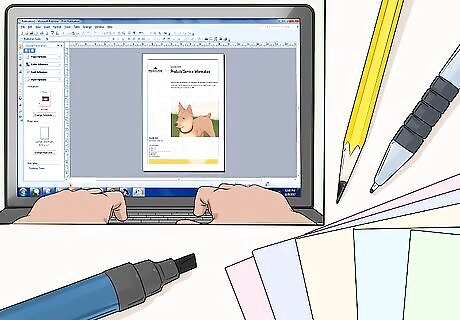
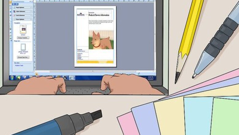
Decide if you want to design your flyer digitally or manually. You can design a flyer digitally with tools such as Photoshop or Microsoft Publisher. Alternatively, you could design a flyer with pen, pencil, markers, etc., and then photocopy the flier at a copy shop.
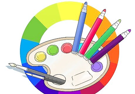
Use color if you can. It could be color in the writing, images, even the paper you print on. Color draws the eye and gets attention. Printing in grayscale on color paper can also be a cost-effective alternative to adding color to your flyers. A color scheme can be very effective. Use a color wheel to come up with basic color harmonies. For example, you could stick to analogous colors (adjacent ones on the color wheel), like different shades of blues and greens. Or, you could use complementary colors, such as red and green. A color matching the image you use in the flyer is even better. For example, if your picture shows a sunrise, you could use oranges and yellows. To make the yellow letters pop, they could be outlined in black.
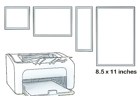
Determine a size for the flyer. Flyer size depends in large part on the function of the flyer and your ability to produce flyers of a certain size. It’s easiest to print digital flyers on printer size paper (8.5 x 11 inches). So, your flyers can be that size, or you might want to cut them in half or quarters if your flyer doesn’t need to be as big (e.g. if it’s a handout). Your fliers can be any size, though, and you can make larger size flyers relatively easily if you’re going to a printer that prints that size.
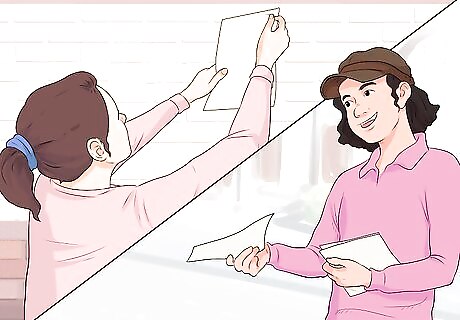
Determine where and how to distribute your flyer . Are you planning on hanging your flyer inside on a bulletin board or outside on a telephone pole? Maybe you plan on handing out flyers at an event or in a busy part of town. Maybe you’re even using the flyers for a mailing. If the flyers are to be hung outdoors, consider printing on stronger paper and with waterproof ink.
Writing Headlines
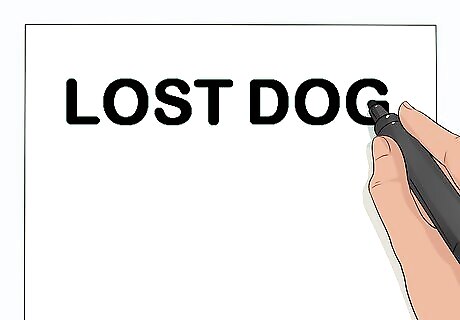
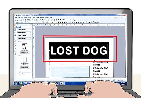
Write a headline. Make it big, bold, and simple. In general, the headline should be no more than a few words, fit in one line across the page, and be centered. A headline can be longer, but the briefer it is, the better the chance it has to capture someone’s attention.
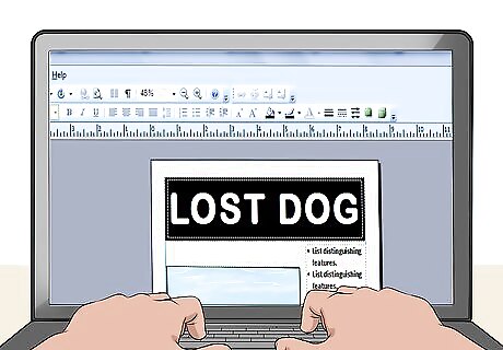
Make it BIG! The lettering in the headline should be bigger than any other lettering on the flyer. You want most people to be able to read it quickly from about 10 feet (3 meters) away. You’ll usually want the headline spaced evenly across the entire width of the page. If it doesn’t quite fit or fit nicely, consider centering the text.
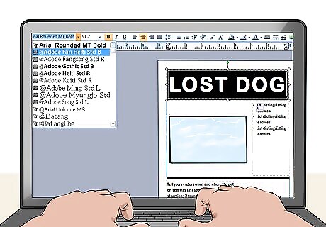
Consider using capital letters or bold fonts. Look at any newspaper's front-page headline; that industry figured this out a long time ago. Don’t get too fancy with this font, as your primary goal here is readability. You can add flair to other parts of the flyer if it adds to your message.
Keep the message very simple. You are trying to grab attention with your flyer, and convey your message in often fractions of a second. Complicated messages and content will likely not make an impact. More detail can follow in the body of the flyer. Do not make people have to think deeply about the content your flyer—it should communicate your message at an almost intuitive level. Think catchy and fun. Which headline jumped out at you? If you're like most people, the "puppies and ice cream" caught your attention. That's not because everybody likes puppies and ice cream; it's because it is bright red, a color that naturally draws the eye. (However, obviously many people like puppies and ice cream, and the unexpected and humorous content adds to the effectiveness.)
Writing Catchy Copy

Add a subtitle. This should be about two or three lines. Since the title is brief and short, the subtitle elaborates on the title, providing more detail of what you’re talking about specifically. Read newspaper subtitles or even press releases for examples.
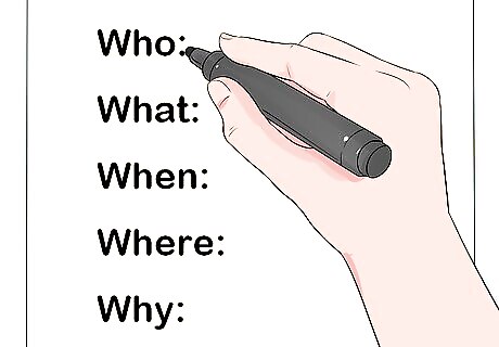
Add detail. While your headline captures people’s attention and leaves them wanting to know more, the body of your flyer is the payoff where you drive home your message. Include pertinent information like the 5 Ws: Who, What, When, Where, and Why. These are questions that people will naturally ask about your call to action. Put yourself in your audience’s position. What would you want to know? Be direct and to-the-point. Make your description text concise but appropriately detailed.

Drive home your message with testimonials. The body of your flyer is also a good place to include testimonials or endorsements. A good testimonial not only provides more detail, but it legitimizes your efforts through a third-party source. If a reader can read your content from your perspective or from an endorser’s perspective, they’re more likely to follow your call to action.
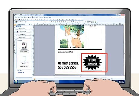
Add emphasis. To emphasize key words, use capitalization, a slightly bigger or bolder font, italics, and other visual hooks. However, do not use these options all at once; choose one or two special effects. Too much creative formatting may look juvenile at best and a bit insane at worst. Use words and phrases that might make your offer more enticing: "FREE", "NEW", "REWARD," etc. These are enticing, but also eye-catching, and they can encourage viewers to follow your call to action. Of course, only include these terms if they actually hold true to your advertisement. You don’t want to mislead your audience. Use the word “you”. This way, you’ll be appealing directly to the reader.
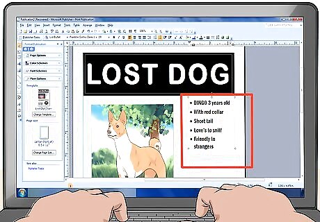
Organize your copy. Add bullet points to organize your message. Boxes surrounding your copy or bullet points can also provide organization, while adding visual appeal. These effects might also make your copy look more professional or business-like, which might be important to your overall look and feel.
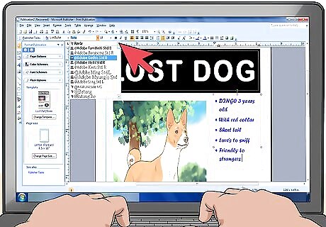
Use other eye-catching fonts. The copy in the body of your flyer does not have to be the same as that of your headlines. Your flyer may have to stand out, so using something different than everyone else may be smart. Your word processor should already be loaded with a number of font options, but if they don’t have exactly what you have in mind, consider downloading a new font. Many sites offer free and easy downloads of unusual and unique fonts.
Include your contact information. Include your contact info—preferably at the bottom of your flyer, so that the flyer’s most important information remains at the top. Add your first name and whatever form of contact you prefer: phone number and/or email address are most common. You can also use the time-honored "tear-off" method: create a condensed version of your flyer text in a smaller font, rotate it 90 degrees and repeat it several times across the bottom of the flyer. Make a partial cut between each occurrence so people can tear off the contact information conveniently. Do not put any information that is private. Do not, for instance, use your last name or give a home address.
Using Images
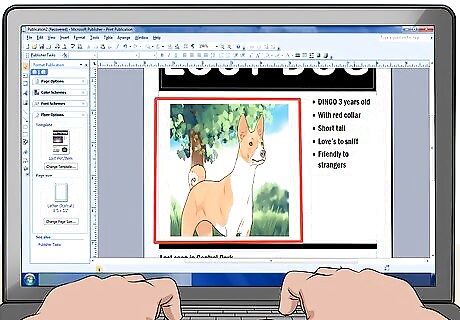
Add a picture or a graphic. A picture is often as important as any words. The human brain will often notice a picture before words. Now that you have the reader's attention, take advantage of it! Give the reader something to look at—people tend to remember concrete, visual messages even more than words. So an image is an effective element, whether it is a logo, a picture of a lost dog, or a graphic.
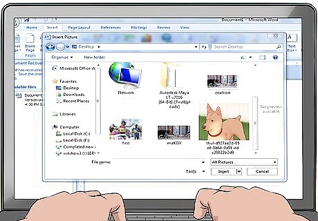
Find an easily accessible image. You don’t necessarily need to create an entirely new image. Consider using one of your own photos or using an image in the public domain that you’ve found online. Some computer programs and suites, such as Microsoft Office, also offer a variety of stock images.
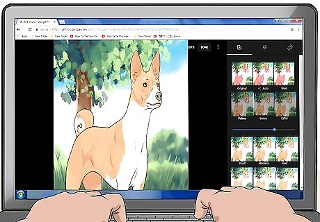
Use an image-editing application to increase contrast. This will make the image more noticeable from a distance once it's printed on the paper. If you don't have an image editor, a free app like Picasa (https://picasa.google.com/), from Google, will work fine. Try to use only one image if you can. If necessary, you can include two images side by side, but any more than this will make the flyer too cluttered, which makes it less likely to catch someone's eye.

Place a description below the image. If you’ve hooked the reader, she’s coming in closer now for the details. A good caption can drive home the message of the image. It can also serve to reinforce or add detail to the compelling stand-alone copy you’ve included on the flyer.

Include a visual frame or border around your picture. Framing your picture might help “anchor” it to the flyer, instead of just having it float out there as a stand-alone insert. Consider inserting a border or light shadow around it. For emphasis, you might even include stars or an arrow pointing to your picture.
Copying and Distributing

Make sure your flyer works. Before making a lot of copies of your flyer, test it out by taping it up on a door to review it yourself. Stand back from it about 10 feet (3 meters) and have a look. Do the main points jump out at you? Looking at the sample flyer here, you can see immediately that it is for a lost dog. Proofread the entire flyer to make sure all the information is accurate and the spelling and grammar are correct. A good way to critique is to ask a friend or family member who has not seen your flyer to take a look at it, and see if they get its message right away.
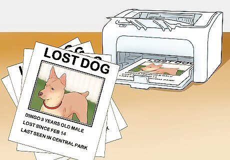
Make copies. Now that you've completed your flyer and tested it, print as many copies as you need. If it's too many for your printer to handle, or if you're expecting rain (the ink output of most home printers will run if left in the rain), find a local copy or office supply store and use a self-serve copier. Black-and-white copies are generally cheaper than color, but do not have the same impact as color. If you decide to go with black-and-white, you might try this: instead of printing the headline and any colored words, leave those sections blank and write them in by hand with a colored marker. Even using a highlighter works well.
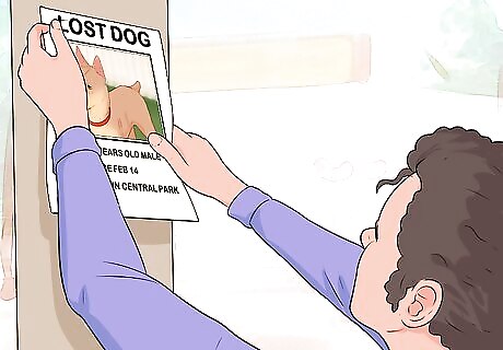
Post your flyer. Where should you post it? Well, where are the people who you want to reach? If you lost your kitty in your neighborhood, post your flyer on telephone poles, bus stops, the local convenience store, the coffee shop, laundromat, at local swimming pools, and any other nearby gathering places. If you lost your purse downtown, post flyers as near as possible to the last place where you know you had your purse. Note that in urban areas there are often restrictions on what you can post, and where––since it's easy to find you, don't flaunt the regulations! Try coffee shops, public bulletin boards, and if you see a pole that's covered with flyers—it's fair game! If you are trying to reach a college or other school audience for your club, generally there are rules and even traditional places to put postings. It is usually a combination of what works (hallways, the doors to bathrooms, homeroom hand-outs) and rules about where it is acceptable to post these things.







Comments
0 comment