views
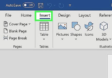
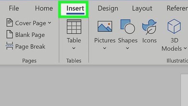
Click the Insert tab in Microsoft Word. It's at the top of Word.
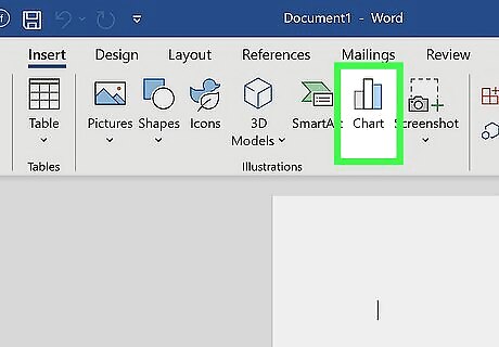
Click Chart on the toolbar. It's the vertical bar graph icon in the toolbar at the top of Word. Depending on your version, it may be on a panel called "Illustrations."
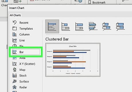
Select the Bar option. You'll see it in the left panel.
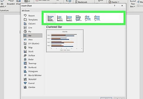
Double-click the bar chart format you want. You can select any of the bar charts in the right panel to choose that type of chart. This places the chart in a spreadsheet window that looks like Excel. The Clustered and 3-D Clustered bar charts are helpful for comparing values across categories. Stacked bar and 3-D Stacked bar charts are best for showing the relationship of individual items to a whole. The 100% Stacked and 3-D 100% Stacked bar charts compare the percentage each value contributes across multiple categories.
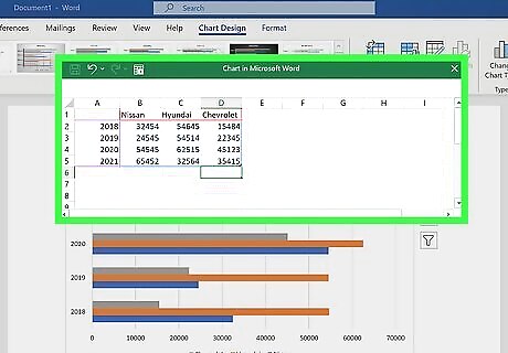
Replace the sample data with your own data. Now that you have the basic chart format, you can just swap out the example information with your own data to display your chart. You can close the spreadsheet window when you're finished. If you need to edit the data again, click the chart to select it, click the Chart Design tab at the top, and then click Edit Data on the toolbar.
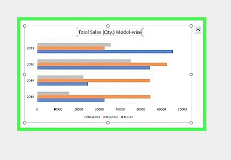
Edit your chart details. While the chart is selected, you'll see four icons at its top-right corner. You can use these icons to make your data look exactly as you want. Click the first icon, which looks like a curved line over a set of horizontal lines, to display and select from a variety of layout and text-wrapping options. Click the + to show or hide chart elements, including axes, category and series names, grid lines, legends, and more. Click the paintbrush icon at the top-right corner of the chart to choose a different chart style.
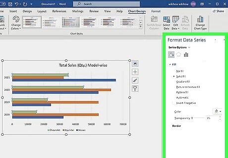
Select different chart elements to view options in the Format panel. As you click different chart elements, such as the bars or gridlines, the Format panel on the right side of Word will change to show you editing options for the selected element. For example, if you click text on your chart, you can change the text color and outline in the right panel. You can change the colors of the chart by clicking Change Colors on the Chart Design tab. For more formatting options, click the Chart Design tab at the top of Word—it's only visible when the chart is selected. This is also where you'll find options for changing the chart type, editing the data, and choosing a different color scheme.


Comments
0 comment