views
Spotting Exterior Design Features
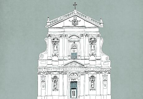
Look for large stone facades with limited color palates. Most Baroque facades are made of cut, carved, and unpainted stone. You may see some brickwork and woodwork as well, especially in northern European versions of Baroque style. Different building materials and decorations may add “pops” of color, but typically you’ll see a monochromatic facade that feels large compared to the overall size of the structure. The facade is the “face” of the building, particularly on its front side. Baroque structures vary in size from single-family homes to basilicas and palaces. No matter the size of the structure, though, the facade usually makes them seem even bigger.
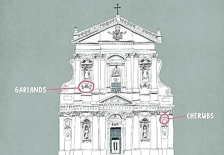
Find sculpted features that seem to be curling, swirling, or flying. One of the hallmarks of Baroque architecture is a sense of movement where there isn’t any. This is often achieved by sculpted stone, metal, or wood features that seem to be spinning, swirling, flying, or undulating. Common sculpted elements to look for include (but aren’t limited to): Lithe angels or chubby cherubs who are flying and playing wind instruments. Scroll features that seem to be rolling or unrolling. Garlands that appear to be sagging from the weight of fruits attached to them. Flames that are lapping from candles, pots, or vases.
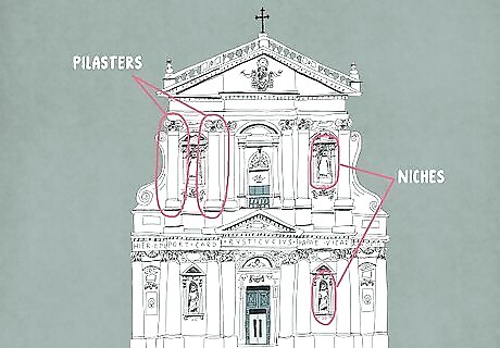
Note how pilasters and niches suggest movement through shadow. Along with dynamic sculpture features, Baroque exteriors express movement by contrasting light and shadow. Changes in depth on the exterior facade interact with the shifting sunlight (or the artificial light of night) to make it seem that key design elements are constantly shifting positions. Pilasters—which look like columns but project out from the facade rather than standing freely—are frequently used to create subtle changes in depth. Niches—recessed areas that may be left empty or contain sculptures or other elements—are used to create areas of shadow.
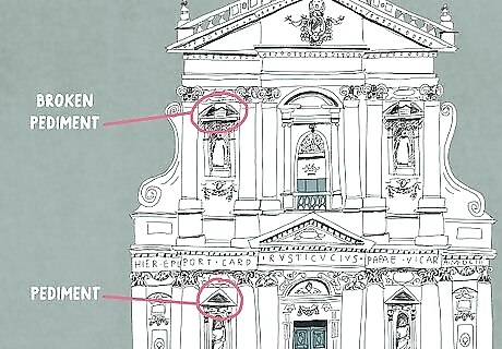
Check for whole or “broken” pediments above doors and windows. In Classical architecture, the pediments—decorative roof-like structures above windows, doors, or the entire front facade—are usually triangular. Baroque designs frequently use either triangular or curved pediments over doors and windows, but they’re often “broken” pediments—that is, they have a gap at the peak that contains a separate design element. You might, for example, see a vase or a coat of arms at the center of a broken pediment. The pediment may also have a scroll-like component on either side of the break.
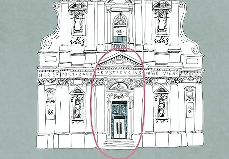
Expect to see the most elaborate designs at the front entrance. While ornate design elements are commonly found at all Baroque-style doors and windows, the main entry door is typically the most ostentatiously designed. It’s very common to spot a family coat of arms, religious symbol, or other sign of ownership and power at the center of a grand broken pediment. Scrolls, cherubs, garlands, niches, and pilasters often frame the main entrance as well. Porticos—small front “porches” with supporting columns—are less common in Baroque architecture.
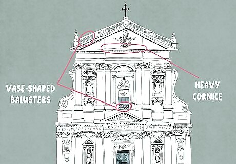
Inspect the facade for heavy cornices and vase-shaped balusters. While the front facades of some Baroque buildings are topped with whole or broken pediments, many have horizontal tops with thick, hefty cornices. The cornices—ornamental moldings akin to interior crown moldings—protrude outward and cast shadows down the facade. Above a building's cornice you might also spot vase-shaped balusters—short, decorative columns—supporting a thick top rail. Alternatively, you might see the vase-shaped balusters along a balcony railing, or at ground level to enclose a courtyard or similar element. The vase-shaped balusters may also have a spiral element to indicate movement.
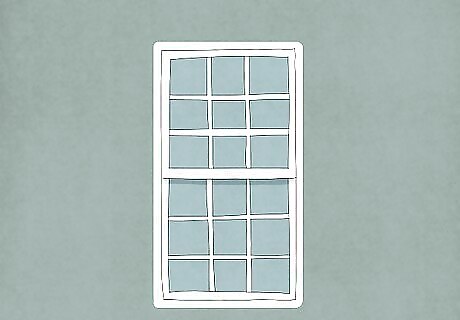
Look for single-hung windows with matching top and bottom sashes. Single-hung windows have a stationary top sash and a moveable bottom sash that you can slide up and down for ventilation. Large panes of glass were rare in the Baroque era, so the sashes typically contain matching sets of smaller glass panes known as “lights.” For example, each sash might be broken up into 9 “lights”—rectangular glass panes in a 3 x 3 pattern. Sashes containing 12 lights (in a 3 x 4 or 4 x 3 pattern) or 16 lights (4 x 4) are also common in Baroque architecture. The windows themselves are usually fairly plain, but are often framed by ornate pediments and other design elements.
Identifying Common Interior Features
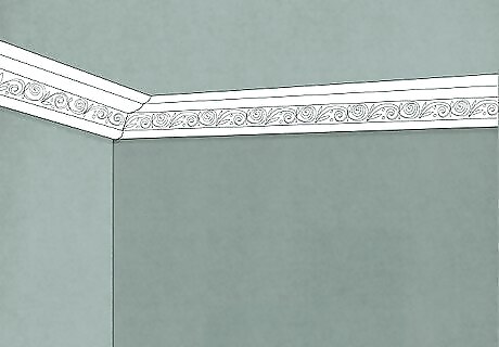
Check for pediments and crown moldings that resemble the exterior. In Baroque architecture, exterior design elements often appear inside as well. For example, crown moldings—which run along the intersection of the wall and ceiling—are a popular Baroque element that replicates the exterior cornices. The ornate stone pediment on the exterior of a door or window might be replicated in wood on the inside. Or, interior niches and pilasters might mimic those on the facade.
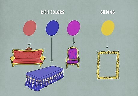
Take in all the rich colors, gilding, and heavy fabrics found inside. Unlike the fairly monochromatic exteriors, Baroque interiors are often full of rich reds, blues, and purples adorned with gilded (gold-coated) elements. While there’s still ample use of stonework, expect to find lots of woodwork, paint, gilding, and fabric. Draperies and furniture fabrics are often thick, heavy, and colorful. The interior of the Palace of Versailles in France is one of the most ostentatious examples of Baroque design. Things as simple as benches have vase-shaped legs with gilding, thick, puffy seat padding, and deep red fabrics with golden elements.
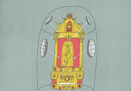
Note how light and shadow are used to create interior focal points. Once again, a Baroque exterior design element—the use of light and shadow—is brought inside as well. Windows, mirrors, chandeliers, and other components are strategically placed to cast both light and shadow in particular areas, thereby guiding your eyes to specific elements. Roman Catholic churches built in Baroque style often direct natural light toward the altar, for example, highlighting its centrality during the Counter-Reformation era in Europe.
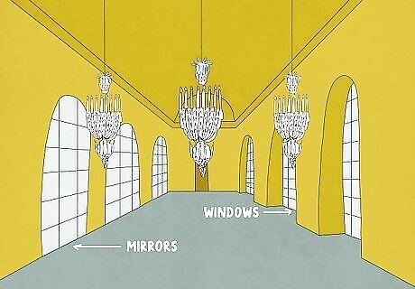
Search for one or more “statement rooms” with ostentatious design. While the whole interior of a Baroque building may look ornate, there’s often a room or two that really go over the top! Much like the grand pediment and framing elements around the main entrance outside, the interior “statement rooms” often indicate awe-inspiring power. Versailles’ famous Hall of Mirrors—with its row of grand arcade windows on one side matched by equally grand arcade mirrors on the other—is a great example of a Baroque “statement room.”
Defining Baroque Style’s Visual Impact
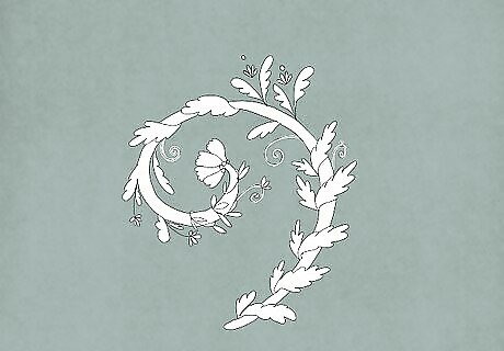
Expect to feel like stationary materials are in dynamic movement. Baroque designers were obsessed with what you might call “static dynamism”—that is, creating a sense of movement where there is none. While the thick stone facade of a Baroque church, palace, or home is clearly not in motion, the use of light, shadow, depth, and design fools your eyes into seeing the opposite. Classical structures tend to feel like they’re “set in stone” forever. Baroque structures feel as though they’re in constant motion.
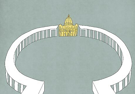
Soak in the theatrical elements of the Baroque style. A Baroque facade or “statement room” can feel like a performative piece, and your eyes are often drawn to “center stage.” The use of light, shadow, depth, and decoration can pull your focus to a grand entrance or an altar, while also making your feel like you’re enveloped by the surrounding activity. St. Peter’s Square at the Vatican is a great example of Baroque theatricality. The curved colonnades surround you and draw your focus towards the ornate entry to the basilica, with its even more ornate interior awaiting your attention.
Ask yourself if descriptors like “lavish” or “flamboyant” come to mind. While Classical architecture often produces intellectual awe with its precision and geometry, Baroque design aims for emotional awe. Its creators wanted to evoke terms like “festive,” “triumphant,” and “ostentatious,” though critics might use terms like “excessive,” “overwrought,” and “reckless.” Your response to Baroque architecture will be uniquely yours, of course, as it should be. But take a moment to really try to express to yourself how it makes you feel! In fact, do this when experiencing any architectural style.




Comments
0 comment