
Making a Digital Pie Chart
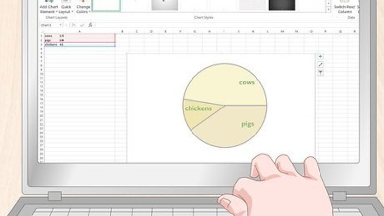
Make a pie chart in Excel by using the graph tool. In an Excel spreadsheet, write each data’s label in the left-hand column. Write each corresponding data point in the row next to it. Highlight the labels and numbers by clicking and holding the mouse down before dragging it over all the labels and data points. Release the mouse and click the small icon that pops up next to the numbers. Click “Charts” and then click “Pie Chart” to generate a pie chart. Note: The order that you list your data points in determines the order that they appear in your chart. This is important if you’re trying to create a sequential chart.
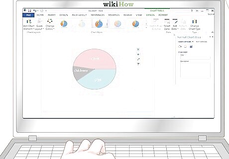
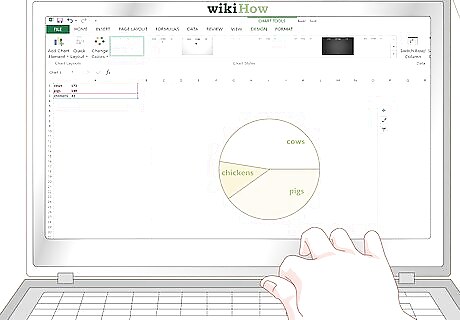
Click the graph button in Word to make a pie chart. In Microsoft Word, click the “Insert” tab at the top of the program. Click the 3 bars with the word “Chart” at the top of the page. On the left side of the window, click “Pie” and select what style you want your chart to be. A new window will pop up with a sample set of rows, colors, and a title. Edit each label by changing the words to reflect what your data represents. Click the title of the chart to edit it so that it reflects the subject of your pie chart. Replace each number next to each label so that it reflects your data. Any pie chart made in Excel or Word can be copied and pasted into PowerPoint. The pie chart that you make in Word will look identical to the pie chart that you make in Excel.
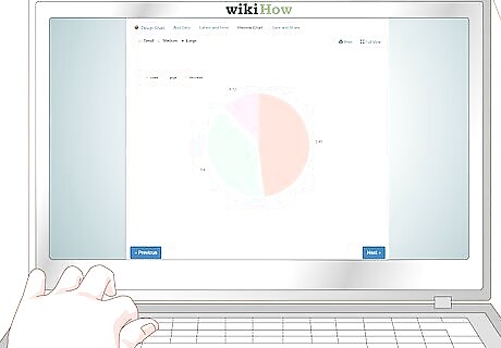
Use a free online program to generate a pie chart if you don’t have Word or Excel. There are several free online websites that allow you to enter data and generate a pie chart. Search online to find a free website that lets you customize your design and enter your own values. You may need to create a free account on some sites to download the chart directly, but you can always use a screenshot program to take a snapshot of the chart. Two of the most popular chart-making tools online are https://www.meta-chart.com/ and https://www.onlinecharttool.com. They let you control a variety of design elements and enter your own information. To use Meta-Chart, click “Pie Chart” on the main screen. Select your style, border, and background color. Click the “Data” tab to enter your numbers and the “Labels” tab to enter the name for each data point. Click “Display” to generate your chart. To use Online Chart Tool, select “Pie” from the dropdown menu at the top of the screen. Select your appearance, colors, and design. Hit “next” to enter your labels and data points. Click “next” and select your font. Click “next” one more time to generate your chart.
Calculating Your Statistics

Write each data point down and list it from high to low. Start with the largest number in your data set. Write that on the top row of a blank sheet of paper. Directly underneath it, write the next-highest number. Give each number its own row to make a column of data points. Note: It’s easier to calculate round numbers, so leave decimals out if you can. For example, turn 20.4 into 20, or 5.8 into 6. This will make things easier and likely won’t affect your data in a meaningful way. For example, if you were making a pie chart of the number of animals on a farm, you would list 24 cows at the top, followed by 20 pigs, and 6 chickens.
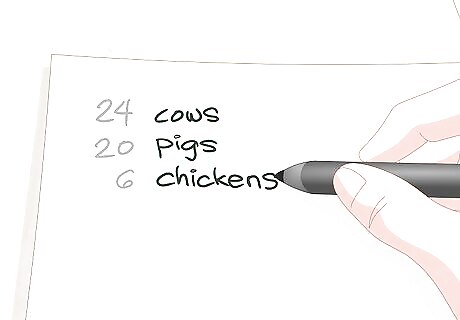
Label each number that you write down so that you don’t forget them. You can either draw symbols or write labels out based on what kind of data your pie chart is depicting. Place each label directly next to its corresponding number on the same row as the number. This will make it easier to keep track of what each number represents. For example, you would write “cows” next to 24, “pigs” next to 20, and “chickens” next to 6. You could also use small drawings to represent each animal or abbreviate them with “C,” “P,” and “Ch.”
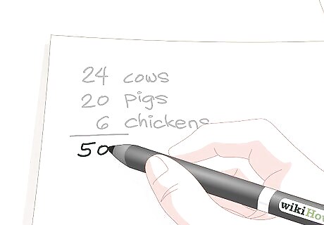
Add all of the numbers together to get your denominator. Draw a horizontal line underneath your column of data points and add each number together using a calculator. Write the sum of your data underneath horizontal line to find your denominator. This number is what you’ll divide each data point by to get a decimal. A denominator is a math term for the number that goes below a fraction line. The idea here is that you’re going to divide each individual number in your data by the denominator to get a decimal. This will show you what percentage of the sum each data point is. You will multiply each decimal by 360 to determine how big of a section it deserves on the pie chart. For the pie chart about farm animals, you would add 24, 20, and 6 together to get a total of 50. This would be your denominator.
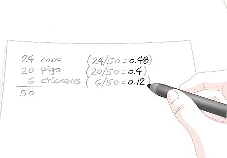
Divide each individual number by the denominator to get a decimal. Use a calculator to divide each data point by your denominator. Write this new decimal out next to the data point that it corresponds with. Each number should be under 1, and the numbers in the new column should also be in descending order with the highest number at the top and the lowest number at the bottom.Tip: These decimals function the same way as a percentage. For example, 0.44 is the same thing as 44%. This can help you conceptualize the size that each data point needs. If you don’t care about precision, you can stop right here and use these percentages to make a rough sketch of your pie chart. If any of your numbers come out to be more than 1, something went wrong. Each number should be a decimal. For the farm animal pie chart, 24/50 = 0.48 cows, 20/50 = 0.4 pigs, and 6/50 = 0.12 chickens.
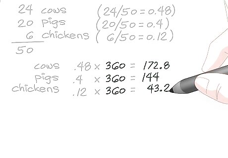
Multiply each decimal by 360 to get the necessary angle for each slice. Use your calculator to multiply each decimal by 360. Write each result next to the decimal so that each set of numbers remains on the row as the original data that it corresponds with. You may need to round the numbers up or down to get them to even amounts. For example, you may need to turn 56.6 into 57. Unless you’re creating a specific type of pie chart that requires smaller calculations, keep it to whole numbers to make your chart easier to read. For the farm animal pie chart, 0.48 cows x 360 = 172.8, 0.4 pigs x 360 = 144, and 0.12 chickens x 360 = 43.2. Round 172.8 up to 173, then round 43.2 down to 43.
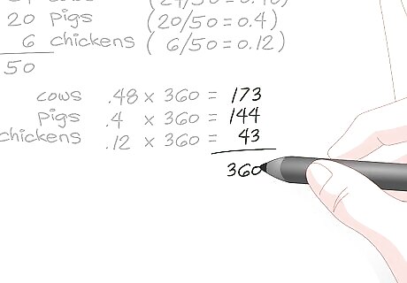
Add all of your numbers up to check your work. Check your work by finding the sum of the calculations that you just made. If the total is 360 when added, it’s accurate. If it’s 361 or 359, you may have rounded a number down or up in the wrong direction. If the numbers are way off, you've missed something and should double-check your work to see where you went wrong. In the example, 173 + 144 + 43 = 360, so you know that the angles will complete a full circle for the pie chart.
Drawing the Chart
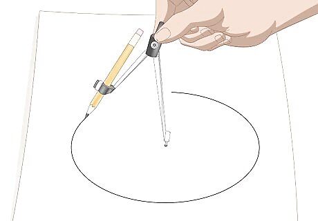
Use a mathematical compass to draw a perfect circle. If you want to be absolutely precise, get a mathematical compass and attach a pencil to the holder by sliding it in. Press the other needle into the point that you want to make the center of your circle. Rotate the pencil around in a circle while holding the needle still to make a perfect circle.Tip: Make your circle as big as you want! You only need to know the angles for each section to make your chart, and those aren’t dependent upon the size of your circle. If you don’t have a compass and don’t mind a possible imperfection, you can use any perfectly round object, like a lid, cover, or bottle, as a straight edge and trace around it. You can use a pen if you want, but you’ll have to start from scratch if you make a mistake.
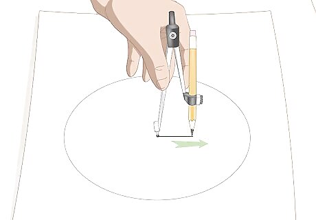
Draw a straight line from the center to the edge of the circle to make the radius. Keep the compass needle in place and rotate your pencil to the top of the circle. Pull the pencil straight down towards the needle after loosening the hinge to create a radius. Depending on the style of your compass, you may need to put a dot in the center after moving the needle then draw the connecting line yourself with a straight edge. The straight line can be vertical (12 or 6 o'clock on the clock face) or horizontal (9 or 3 o'clock on the clock face). The segments you create then follow either a clockwise or counter-clockwise sequence.
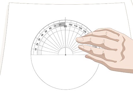
Line a protractor up with the radius. Place the small hole in the bottom of your protractor directly on the point where your compass needle was. Line the straight line up with the 90-degree hash mark on your protractor. The hole at the bottom of your protractor is called the crosshair and it is used to make perfect 90-degree angles by creating a straight line with the 90-degree hash mark.
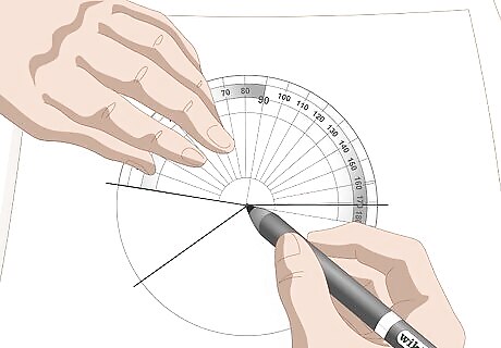
Draw each slice, moving the crosshair each time that you draw a line. Keep the crosshair centered on the center of your circle and add your first data point to 90. Find this number on the outside of your protractor and make a hash mark. Then, draw a straight line from the hash mark to the center of your circle. Make each new line that you make the 90-degree center for the next section that you calculate. For example, if you were making the farm animal pie chart, your first number is 144. Add 144 to 90 to get 234. Make a hash mark at 234 degrees and then make your line. Rotate the protractor and use the line you just made as the new 90-degree mark. The next data point is 43 degrees. Use the line you just made and add 43 to 90 to get 133 degrees. Make a hash mark at 133 degrees and draw the line to the center. Your remaining section will be 173 degrees. You can use the base of the protractor and skip the step where you add a number to 90 if you want. You’ll have to draw at an angle though and it can be easier to make a mistake if you do this.
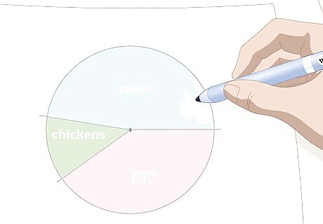
Color each segment and compose your key. Create a key for your pie chart. Color code each section so that it is easy to determine what each slice refers to. Outline your circle and each pencil mark with a black permanent marker if you really want to make the colors pop. You could even use a pattern, like a cow’s spots to represent cows!


Comments
0 comment