
views
Defining Your Goal

Define the primary message of your infographic. Clearly define the primary message of your piece. This is the one thing that your audience will take away from the infographic. Keep your message simple and easy to understand. Successful infographics utilize a single theme or message to make the information easy to read and retain. Do not make your message too complicated or try to define more than one message at one time. Write a simple outline that defines why you are making an infographic. Focus on the goal being to teach and inform the audience or call your audience to take action. Come up with a catchy title that draws people in and makes them curious.

Determine who your primary audience is and what the best method is to reach them. Determining who your audience is will be the single most important step. Here you will define what type of person, demographic, age group, or party of interest your infographic is intended for. Use simple fun text for elementary school children, and concise large text for older individuals. Make the message relatable to the target audience (ie. Elementary school children will not be interested in learning about skin care, but adults and dermatology patients will). If you have trouble defining your audience, think about who the information will benefit the most.
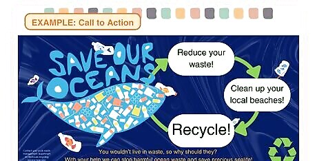
Consider what action you want your audience to take after viewing your infographic. The main use for an infographic is to display information that is quick and easy to read and retain. Most infographics do not simply teach the viewer, but also ask the viewer to do something. This is called a “call-to-action”. Imagine the response you want from your audience. Here are two examples: A hand washing infographic that illustrates the reasons for handwashing and calls the audience to action to help prevent the spread of germs. An environmental infographic that depicts what happens to sea life when exposed to trash and calls the audience to clean up the beaches or recycle.
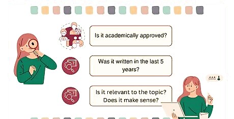
Research and gather up-to-date information on your topic. Conduct research on the topic you choose so that your information is accurate and up to date. Make sure the information is within the last couple of years so that you can be sure it is still relevant to the topic. Retrieve information from scholarly pages, journals, and publications that are reviewed (Articles are okay if the author can be verified and is knowledgeable). Do not use information that is old or outdated on a topic that is current (i.e. Science, technology, medicine). Only use information that is relevant and adds to the topic or message.
Applying the Information
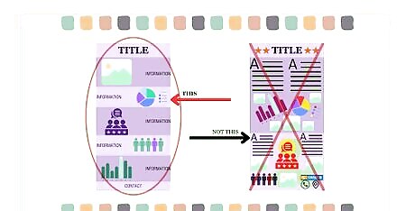
Organize your information in a logical flow. Create an outline for your information or make a storyboard to help you visualize how you want to portray and deliver your information. Arrange your data in a way the allows the reader's eye to move naturally through the information. Set a focal point and branch data away from it by using text size, color, and positioning to emphasize key points. Do not overcrowd your infographic with too much text or too many graphics. Allow some space between elements and remember, simple is better.
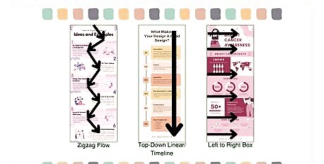
Choose an appropriate layout. Select a layout that will not distract from the information and leave you with enough space to add all the essential evidence to your message. Lay out your information in various ways (horizontal, vertical) and decide what looks best. Ask someone for input. Use a user-friendly design program to complete your design and add your information and visuals. Canva is a good free resource for creating infographics and has many templates to choose from and edit. Other programs include Adobe software such as Photoshop or Illustrator, Venngage, Microsoft Word, and Excel. The most effective layout starts in one corner at the top of a page and zigzags down to the opposing corner. You may also use an L method, which means to layout the page to travel up one side and across the top to the furthest corner. Additionally, a simple layout is a top-down, or left-to-right variant.
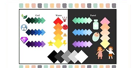
Choose an appropriate color scheme to fit the tone. Use a color palette that matches the brand, topic, field, or tone of your infographic. Stick to between 3 and 5 colors to make the design seem cohesive. Choose colors that don’t detract from the mood or suggest the wrong emotions. Do not use bright pink and vibrant orange on a business infographic for a law office. Instead, try blue or gray. Some color themes to try: Warm colors (red, orange, yellow) are optimistic, energetic, and confident. But they can also portray anger, violence, caution, and danger. When paired with white, they can appear professional. Cool colors (blue, green, and purple) are calm, comforting, harmonious, and balanced. The three cool colors have more varied tones than warm colors do. Green: Nature, life, good luck, money, renewal. Lends to stability and wealth, or the natural world. Blue: Masculine, reliable, tranquil, responsibility. Lends to the medical field and other areas where strength and dependability are important. Purple: Regal, mysterious, romance, creativity, military honor. Lends to luxury, beauty, and romance. Pastel colors may be suitable for themes dealing with children, various medical fields, the sciences, and subtlety.

Keep text concise and easy to read with a consistent style throughout. Use a cohesive color pallet with colors that go together and shapes that are similar. Use fonts that are similar and easy to read or are directly opposite of one another (serif vs sanserif) to add contrast. Always choose fonts that are basic and legible. Refrain from using cursive or handwriting fonts. Sanserif fonts include fonts such as Arial, Franklin Gothic Book, Helvetica. They do not have “feet”. Serif fonts include fonts such as Times New Roman, Baskerville, and Georgia. They have “feet”. Limit text to essential information only. #* Use font colors that contrast with background colors to make it easier to read (white on black, black on pastels, dark green on baby blue).
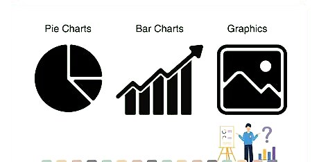
Use images or other graphics to represent data and draw the eye. Use images, icons, and illustrations that enhance and help tell the message you wish to convey. Consider using pie charts, graphs, and other statistical graphics to illustrate data instead of text only. Add visuals that are relevant to your piece and the topic Make use of headers, footers, and table structures to format your information in a readable way. Use visuals to create a hierarchy of information. (ie. adding visuals to the center of your piece will draw the eye closer to this section)
Revising and Testing
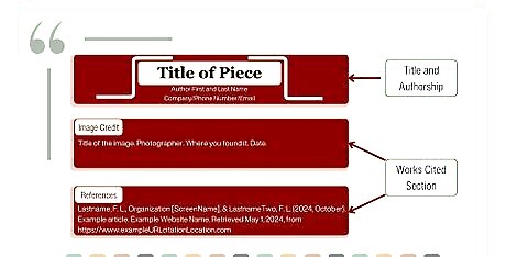
Cite all your sources for credibility and to give proper credit. Citations can be included at the bottom of your infographic in smaller text than the rest of the information. Always give yourself credit for the overall infographic. If you are part of a design group or firm, be sure to include your logo or name near the title. Include a step for the audience to follow if they wish to seek more information. This can be a phone number, address, or website. Cite your source information in APA format in a work cited section at the bottom and include in text parenthetical citations for reference. Cite all images that you did not make or take yourself with captions on the image or descriptions on the work cited page.

Review and Revise for grammar and spelling errors. Reread, review, and revise constantly to avoid spelling and grammar errors in the text. Double-check all data, if your infographic includes it, and make sure that contact information is correct. Use the built in spelling and grammar checker on the program you used to draft your information (Word or Google docs). Or install a third-party spelling and grammar checker, such as ProWritingAid or Grammarly. Revisit the source location of your data to make sure numbers, dates, and other tabled information are accurate.
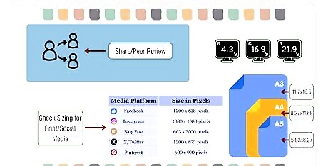
Test your infographic for print and digital dispersal by sharing it with individuals that fit your target audience. Always consider sharing a draft of your infographic with people that are part of your intended audience for feedback. Use this feedback to revise your infographic. Ensure that you test your infographic after the revisions and feedback for proper sharing practices. Share your infographic with friends, colleagues, parents, or other family members that match your audience. (i.e. An infographic intended to reach women over the age of 30 about breast cancer could be shared with an aunt, sister, female coworker, grandmother, etc.) Ask questions of those you review your infographic to help revisions. Do you have any remaining questions? Do you need more information? Is the information understandable? How do the colors make you feel? Can you read the text or charts without effort? Ensure that your infographic is sized correctly for the type of media you wish to present it on. Create a separate variation of your infographic that can be sized and shared on social media or websites. Check the size limitations of the platform you intend to share on. Infographics typically have dimensions of 663×2000 pixels, 600×1800 pixels, or 735×1100 pixels. By using these dimensions, the infographic is easily viewable on computers or mobile devices and can be shared on social media. Remember dimensions may vary according to the device and platform.


Comments
0 comment