views
New Delhi: Google has updated its Hangouts for desktop app with new design elements that now bring all your conversations under one window and offer bigger headers than before.
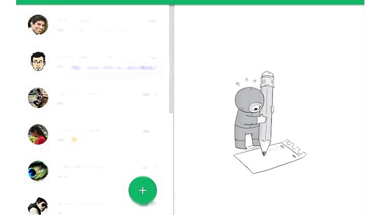
The desktop app for Windows, Mac, Linux and Chrome includes Material Design style elements, like the floating action button for starting a new hangout and wide colourful headers on the top.
A report on Android Headlines notes that the new design also includes the shadows to discern the ending and starting points between segments of the UI apart from the slightly pointed dialogue boxes within the app.
For some time, Google is allowing users to switch back and forth the old and new UI styles. The old UI remains in place by default.
To check the new interface, you can open the app, go to the hamburger menu button in the top left corner to access the settings and scroll down to choose the ‘disable transparent UI.’ Doing so will close the app and restart it with the new interface.
It will then show your list of conversations in one panel next to the currently open conversation in a panel to the right, with everything in one single window.


Comments
0 comment